Hi JoEllen, Thanks again for your time and for sharing your insights. It was great to catch up yesterday. I'm resharing our credentials, showcasing the work we’ve done for Tan Bun Skrati and Caribbean Blue Naturals, along with some recent projects highlighting e‑commerce work we’ve delivered for other clients. Let’s connect again in a couple of weeks. Thanks Adge

Shirley

A Caribbean Classic, Refreshed

Part of the Wibisco family of products, Shirley biscuits have truly been a Caribbean Classic for over 60 years. Nothing else in the world quite matches up to its unique, creamy taste and it continues to be a favourite snack today. Shirleys is a cupboard staple in the Caribbean and is enjoyed by generation after generation.
Fullwidth image

More Than A Biscuit

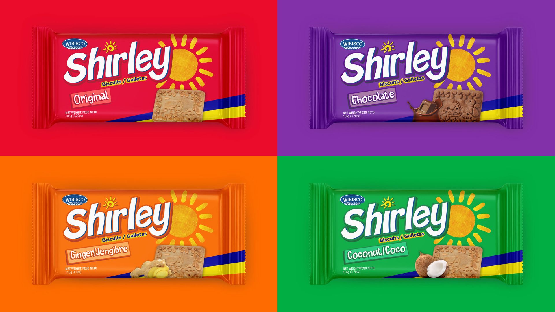
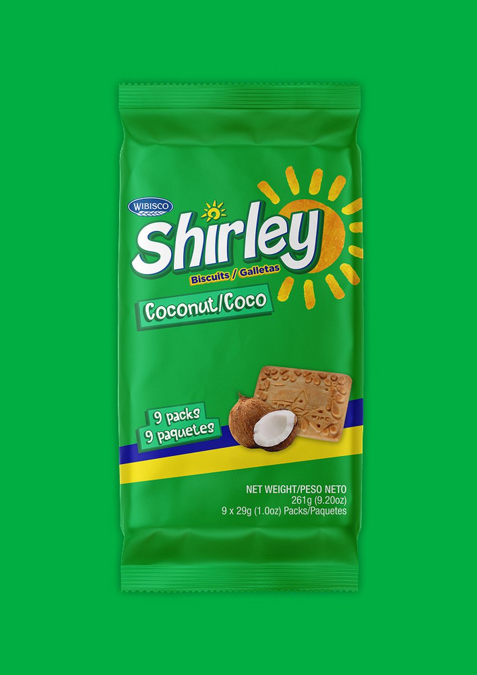
As a brand that has so much familiarity, tradition and meaning to families all over the Caribbean, we had to approach the brand refresh with an element of care. Visually busy and lack of hierarchy informational hierarchy on the packaging, the brand started to lack prominence. Though the colours stood out and the brand had existing recognition with the consumer, it could work harder and be elevated.
Fullwidth image

Recipe For Success

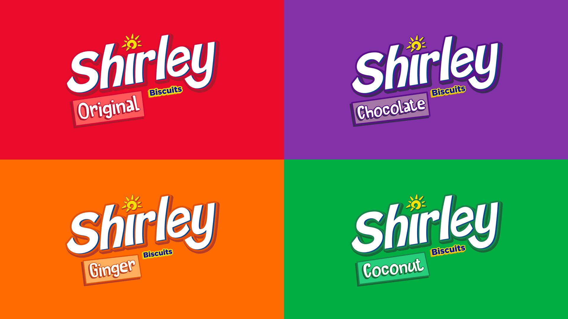
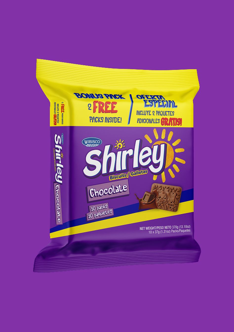
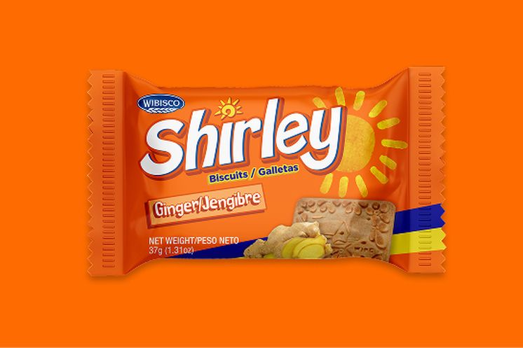
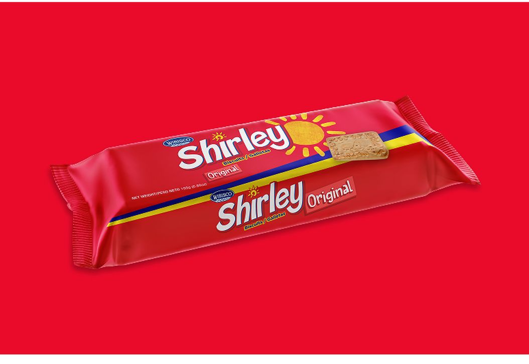
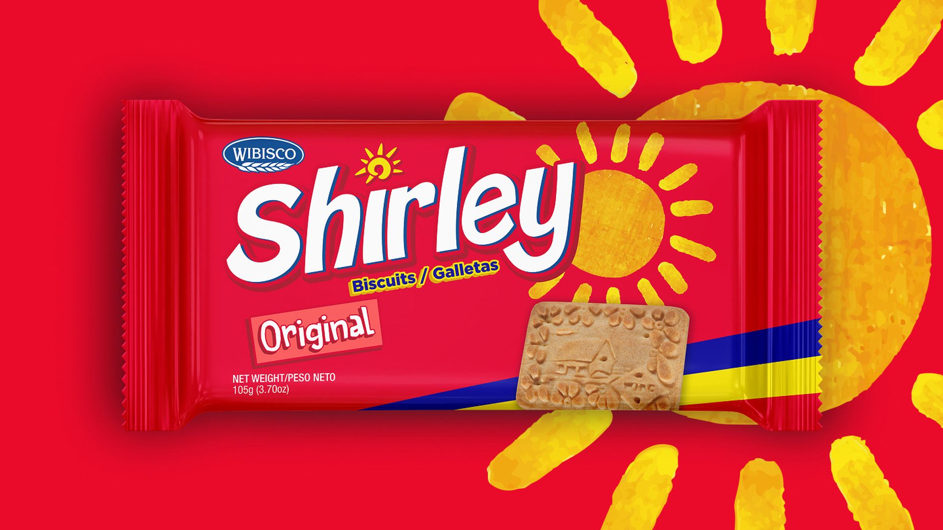
The solution started with research into competitor brands, cross-category confectionery; and a review of the existing brand and packaging. Identifying visual elements that were core to the brand and opportunities to improve the architecture. From there, we tweaked the Shirley’s logo to be more modern, unique and playful in aesthetic. Along with this we created a system they clearly identified the flavour, and worked in harmony with the brand mark.
Fullwidth image

Small Touches

Toning down, but not removing the blue and yellow streak keeps the tie to their home nation of Barbados. Tweaking the sun as the tittle in the ‘I’ of the Shirley name. And adjusting the existing colour palette helped elevated the brand, while maintaining recognition for the die hard fans of Shirley biscuits.
Small Touches
large image

That's A Wrap

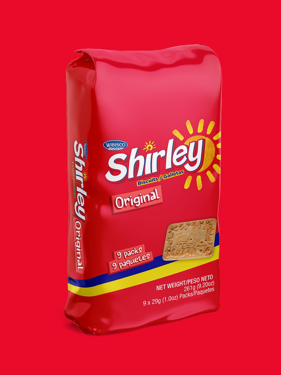
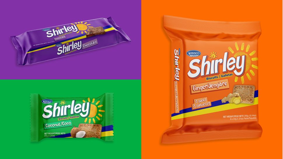
The refresh not only elevated the brand and packaging, but created a clear information hierarchy on pack, an adaptable architecture that works across the range of SKU’s. Leading to a clear system that allowed for the multilingual needs of a product for export. Whilst not losing any of the brands heritage that families had grown familiar to.
large image
large image
Our website uses cookies to ensure you get the best experience.Cookie Policy